


Why Point And Figure Charts
In my chart deliberations, I use and share frequently Point & Figure chart analysis. Many people ask why. What follows is an answer by Tommy Dorsey at Dorsey Wright. (A technical analysis service I cannot recommend sufficiently often or highly. iow, subscribe!) A real time example follows that précis.
-- David M Gordon / The Deipnosophist
=================================
Many people have asked why we use point and figure charts instead of bar charts. We have no arguments with those who choose bar charts. An experienced practitioner can do quite well with them. They do show volume and P&F charts don't but analysis of volume is a deceptive and precarious process, particularly in the market of today with many computer programs doing program trading. In any event, if the volume is sufficient to cause a significant movement in price, this movement will be clearly reflected on the P&F chart.
Besides being difficult to read, daily bar charts easily can cause confusion. One frequently gets bogged down in trivia and loses sight of the overall picture. While this can be remedied by keeping weekly or monthly charts on the same stocks, why should one bother? If you keep P&F charts you get both the immediate and the long-term view. Listed below are the reasons we think point and figure charts are superior.
1. Formations are easier to recognize and interpret.
2. Trends are readily identified and trend lines can be drawn with amazing ease.
3. Frequently, valid targets can be established.
4. With one tool, the technician can see both the near term and long term position of a stock.
5. It is the easiest kind of chart to keep and therefore allows you to follow more stocks.
6. It enables the investor to do what he should do - stay on a winner while it is winning and get off a loser quickly.
==========================
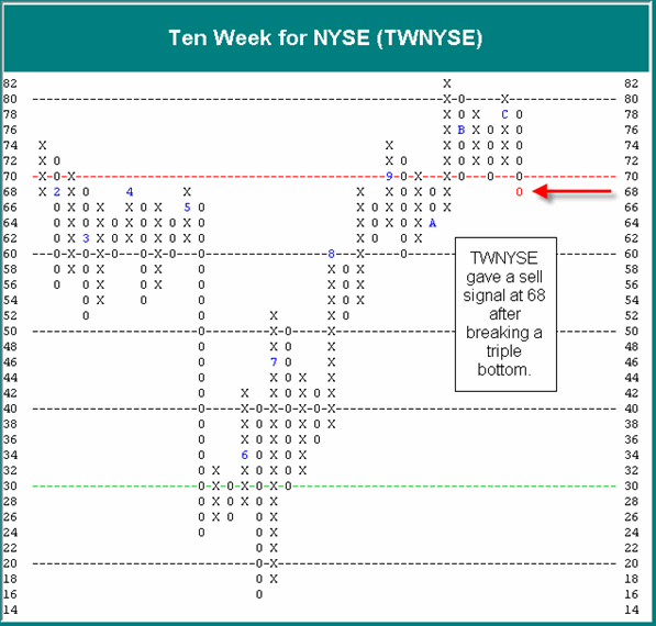
That the NYSE Percent of Stocks Above Their Ten-Week Moving Average [TWNYSE] gave a noteworthy sell signal. The TWNYSE is one of our two main short-term market indicators, with the other being the NYSE High-Low Index [HILO]. Although the HILO remains on a buy signal, yet up at lofty levels of 94%, the TWNYSE has moved to a sell signal, doing so by breaking a triple bottom at 68%. This comes after reaching a high of 82% in October. This sell signal is only the first "shot across the bow" with respect to our market indicators. Now we will watch for confirmation from the HILO, before taking a more negative posture with respect to the short-term. On an intermediate to long-term basis, our market indicators all remain on offense, albeit at very lofty, overbought levels. Overall, offense is still dictated, but in a more cautious fashion, requiring different kinds of plays, compared to back in June when our market indicators were bottoming out with more attractive field position. So now that we are up in the Red Zone, and seeing the first hint of deterioration (with the TWNYSE sell signal), it pays to stay alert and monitor the indicators closely. Of course, we will keep you posted to any key changes that unfold.
 [click on image to enlarge]
-- David M Gordon / The Deipnosophist
=================================
Many people have asked why we use point and figure charts instead of bar charts. We have no arguments with those who choose bar charts. An experienced practitioner can do quite well with them. They do show volume and P&F charts don't but analysis of volume is a deceptive and precarious process, particularly in the market of today with many computer programs doing program trading. In any event, if the volume is sufficient to cause a significant movement in price, this movement will be clearly reflected on the P&F chart.
Besides being difficult to read, daily bar charts easily can cause confusion. One frequently gets bogged down in trivia and loses sight of the overall picture. While this can be remedied by keeping weekly or monthly charts on the same stocks, why should one bother? If you keep P&F charts you get both the immediate and the long-term view. Listed below are the reasons we think point and figure charts are superior.
1. Formations are easier to recognize and interpret.
2. Trends are readily identified and trend lines can be drawn with amazing ease.
3. Frequently, valid targets can be established.
4. With one tool, the technician can see both the near term and long term position of a stock.
5. It is the easiest kind of chart to keep and therefore allows you to follow more stocks.
6. It enables the investor to do what he should do - stay on a winner while it is winning and get off a loser quickly.
==========================
That the NYSE Percent of Stocks Above Their Ten-Week Moving Average [TWNYSE] gave a noteworthy sell signal. The TWNYSE is one of our two main short-term market indicators, with the other being the NYSE High-Low Index [HILO]. Although the HILO remains on a buy signal, yet up at lofty levels of 94%, the TWNYSE has moved to a sell signal, doing so by breaking a triple bottom at 68%. This comes after reaching a high of 82% in October. This sell signal is only the first "shot across the bow" with respect to our market indicators. Now we will watch for confirmation from the HILO, before taking a more negative posture with respect to the short-term. On an intermediate to long-term basis, our market indicators all remain on offense, albeit at very lofty, overbought levels. Overall, offense is still dictated, but in a more cautious fashion, requiring different kinds of plays, compared to back in June when our market indicators were bottoming out with more attractive field position. So now that we are up in the Red Zone, and seeing the first hint of deterioration (with the TWNYSE sell signal), it pays to stay alert and monitor the indicators closely. Of course, we will keep you posted to any key changes that unfold.
 [click on image to enlarge]
Labels: Market analyses
posted by David M Gordon | 1:31 AM
![]()
<< Home